Starting back in September, I blogged about all of the St. Louis area conferences and a select number of KC conferences where I could get data. I used a formula that I had developed using VPS (value player score) for returning players, the percentage of returning scoring, and the point differential (points for minus points against) from the year before. The formula predicted the winning percentage for each team analyzed. I did not know how well the predictive formula might work. Now you are going to find out.
The theory behind using VPS for returnees is that the VPS values above 1.0 suggest a winning player and that they are doing more positive things (scoring, shooting well, rebounding, making assists, getting steals and blocks) versus negative things (missing shoots, making turnovers, fouling). I have found that winning has a good correlation to team VPS.
One would assume that the more players that are returning to a team, the more successful that team might be, especially if many of those players received playing time and contributed.
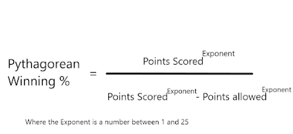
Point differential has a strong correlation to winning percentage. NBA statisticians have employed Pythagorean winning percentage, with a different exponent than I used for high school, with good success in predicting winning. The NBA uses an exponent factor 13.91 while I found an exponent of 6.4 worked better. Here is the Pythagorean Winning % formula:
Unfortunately, by the time you have played games to develop the point differential, you already know your winning percentage so the Pythagorean winning % really is just describing what you already know. The real lesson from Pythagorean % is that playing tough defense and getting stops while being efficient on offense is what wins games. The bigger the difference in points scored to points allowed, the more it separates the real winners from losers.
So I went back to my Fall blogs and pulled up my predictions, added the actual wins and loses, points scored and points allowed, and the Pythagorean winning %. I then looked at the scatter plots to see which factors correlated to predicted wins and which did not. A good scatter plot looks like a thick dotted line, meaning predicted wins correlate well with the factor plotted. A bad scatter plot looks like a round shotgun blast, meaning predicted wins do not correlate well or at all.
Some of the scatter plots were eye-openers!
The first thing I plotted was the Returnee percentage vs. the Actual winning percentage and I was surprised by how shotgun-like this plot looked. In other words, winning does not necessarily depend upon how many players are coming back or how much scoring is returning. Surprise, Surprise. Winning Coaches have solid JV, Frosh, and feeder programs and they remake their teams with winning personnel that is ready for the big stage. Having 90% of your team back does not mean you will have a winning season.
This was mind-boggling because I keep reading and hearing about how many seniors are graduating or how many underclassmen are coming back. Bull crap. Doesn't matter if you have a legacy program that continues to feed your varsity with well-coached JV and frosh players.
The second plot was the actual winning percentage plotted with the Pythagorean winning percentage. This plot shows a high correlation between wins and point differential, as expected from NBA analyses and experience. But predicting point differential is nearly impossible for the next season unless your program is locked and loaded to win year-in and year-out.

The third and fourth plots below show a strong correlation between Point Differential and both the team's rating (in Gramps Braggin Rights) or Winning percentage (%). Nearly 90% of the Winning Percentage can be explained by the variation in Point Differential.
The plot of Point Differential vs. Gramps Braggin Rights Ratings is also good but only about three-fourths of the variation between Point differential and Ratings are explained. The relationship may be explained more fully when school size is also considered.
Finally, I looked at Actual wins vs Predicted wins. That shows that there is a correlation, albeit weak between actual wins and predicted wins. Some teams met expectations and some fared much worse or much better.
So it appears that Gramps needs to go back to the drawing-room to find a better estimate of future success than the formula I used this past fall.
Here's all the teams by conference:
Here are the teams listed by rating:
And finally, here are my predictions sorted from best to worst. Looks like I need to find a formula that will predict those teams in red where I missed their season record by a mile:
Maybe someone in that group of red teams can let me know why the wheels fell off the wagon for their school.
As Porky Pig says at the end of Looney Tune Cartoons, "Th-th-th-th-th-th-that's all folks"


Comments
Post a Comment